No, we are not talking about digital banners that you install on the side panels of websites.
Banners stands are one advertising tool used frequently for both online and on-site marketing. Banners are extremely effective for displaying your brand name and your key marketing message, whether you’re doing that at a Congress, a meeting, a website, or an e-newsletter. Banner ads have never really lost their value as a promotional tool.
However, coming up with a design for a unique banner is not easy. There are hundreds, perhaps thousands of banner designs in every color, style, and format. One can easily get confused as to which one is best suitable for their start-up.
Here are seven banner design ideas for start-ups:
1. Keep the Banner Design Ideas Simple
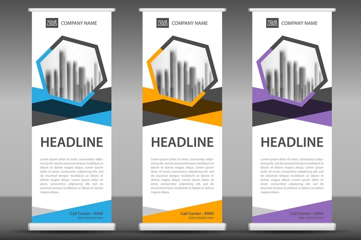
Most people think that the best banner design ideas must be complex with exotic colors and shapes. But the fact is that complex banners may appear nice, but often, they are forgotten by the reader. If you look at all the successful companies – Coca-Cola, Amazon, Apple, and a whole host of others – they all have simple logos and use simple banners.
The trick is to create something that will register with your target audience, and that can be as simple as an apple.
2. Practice Clarity in Your Banner Design
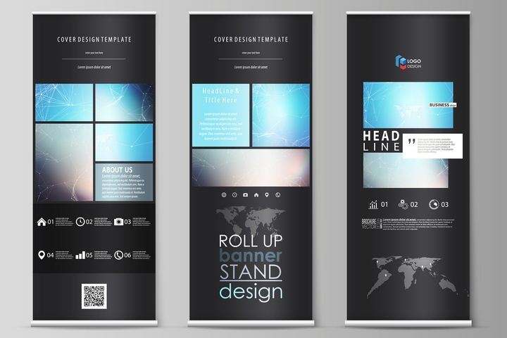
It is generally a good idea to have a banner with a simple message. This is especially true for start-ups as their goal is basically to inform their target customer about their primary product and/or service. When deciding on a banner design, do not clutter the banner with a lot of text as it can make it hard for your audience to read.
Let’s face it: Most people love banners that only have a few words. The key is to remain focused on the message. You are not trying to sell a book. You’re just trying to make your start-up marketable.
3. Let Your Banner Design Ideas Communicate

Before you design your banner, ask yourself: What message do you want to communicate to the public. Is it a service? A romantic getaway? An exotic product? Pick up the strongest word that your market values and go with that.
4. Make the Banner Designs Exciting

Here is something that should be common sense, but, based on today’s results, is not.
When you begin your advertising project, one of the very first things you need to do is to work on the design of the banner and put some time into making it exciting. You want the banner to scream about your start-up. You want the banner to get attention instantly. To do that:
- Do not use too many colours because this simply confuses the customer.
- Ensure that there is contrast so that the text is clearly visible.
5. Limit the Number of Fonts
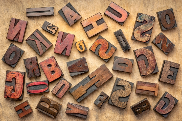
Generally speaking, your banner design ideas should not have more than two fonts, unless you are selling ice cream or toys. Select a lightweight and heavyweight font and play around with several font designs until you get the right mix. In general, a fancy or curvy font should not be used in the body of the banner, it is best used for a headline, and it must be readable.
6. Have a Dominant Theme

When you come up with banner design ideas for your start-up, you need to prioritize your text and color. If you want the visual element to stand out, design it in a way that it makes up most of the background. If you want the text to stand out, then make it bold and large. However, do not make so big that it crowds out the other information on the banner.
7. Make the Banner Design Consistent with Your Start-Up

You want to make sure your banner design reflects and is consistent with the look and feel of your start-up. If you have a logo, use that. If you have brochures and you’re following a certain colour scheme, remain consistent and design your banner in those colours. This will help the audience register the look of your brand, which is the ultimate goal of using a banner.
Remember, banners are used both online and offline. Just make sure that the size of your banner is consistent with the size of the platform you’re using. For example, if you have a full-page banner ad on a particular website, design your banner accordingly; but if you have a small 300×300 space, for example, make your message concise and keep the design consistent even if this is not a big banner.
The key is to create a design that is easy to read and attractive to look at. This applies to not just banners, but a diverse array of other advertising tools, whether it is pamphlet marketing your services or a newspaper advertisement. If you abide by these two simple but effective ideas, then you can see an incredible amount of interest in your brand.


